Data Source
Malaria dataset contains 3 tables which include death rate and incidence rate from malaria worldwide from 1990 to 2016.
Visualizations
Here are 3 informative visulizations based on the malaria dataset. The first visual shows the death rate by country each year. The second visual shows the trend of worldwide death rate from malaria over time and use a rolling window to show the overall trend. The third visual shows the proportion of different age groups of malaria deaths.
Mapping Annual Death Rate to World Map over time
The colorbar shows the death rate per 100,000 people. The slidebar enables the users to select the time interactively. This is the age-standardized death rate in 1992. The death rate is highest in Africa. Some countries in west Asia also have a high death rate.
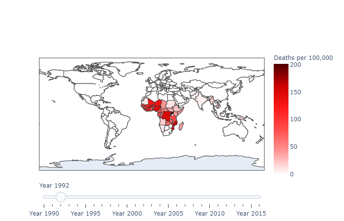
We can also observe the death rate in 2008 if we toggle the slidebar. The overall distribution of malaria death rate doesn't change much in these years while the death rate in some countries in Africa (e.g. near the east coast) decreases.

Annual Deaths by Age Group over Time
This figure shows the annual deaths from malaria by age group from 1990 to 2016. The kids under 5 comprises over 80% of all the death cases while the deaths of other age groups are much less. The deaths from malaria reaches the peak in 2003 and decreases dramatically after 2008.

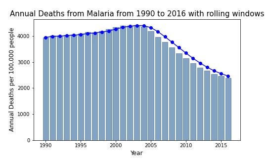
Annual Deaths over Time with a smoothing curve
The width of rolling window is 3 years.
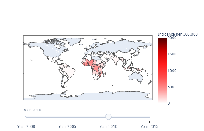
Malaria Incidence rate from 2000 to 2015
The incidence rate all over the world decreases from 2000 to 2015, especially in east Europe and South America. The incidence rate in Africa also drops to some extent.

Supplement: introduction of code to create interactive world map
- create the color scale
I choose red as the color of my graph and the higher the death rate/incidence rate is the more darker the color is.
  scl = [[0.0, '#ffffff'],[0.2, '#ff9999'],[0.4, '#ff4d4d'], \
         [0.6, '#ff1a1a'],[0.8, '#cc0000'],[1.0, '#4d0000']] # reds
- create and reshape the dataset
The malaria dataset has multiple countries and years and we should first split the dataset by year to create a single choropleth graph.
  for year in malaria_deaths.Year.unique():
      malaria_deaths_year = malaria_deaths[malaria_deaths.Year==year]
      malaria_deaths_year['text'] = malaria_deaths_year['Entity']+str(malaria_deaths_year['Entity'])
      data_one_year = dict(type='choropleth',
                          locations = malaria_deaths_year.Code,
                          z=malaria_deaths_year['Deaths - Malaria - Sex: Both - Age: Age-standardized (Rate) (per 100,000 people)'],
                          colorscale = scl,
                          zmin=0,
                           zmax=200,
                          colorbar= dict(title="Deaths per 100,000",tickvals=[0,50,100,150,200],ticktext=['0','50','100','150','200']))
      data_slider.append(data_one_year)
Notice: you need to specify the range of color scale by zmin and zmax to avoid the overlapping of labels.
- create the data used for slidebar
 steps = []

 for i in range(len(data_slider)):
     step = dict(method='restyle',
                 args=['visible', [False] * len(data_slider)],
                 label='Year {}'.format(i + 1990))
     step['args'][1][i] = True
     steps.append(step)

 sliders = [dict(active=0, pad={"t": 1}, steps=steps)]
- Specify the layout and data, then call plotly.offline to dispaly the figure
 layout = dict(sliders=sliders)
 fig = dict(data=data_slider, layout=layout)
 plotly.offline.iplot(fig)